Summary
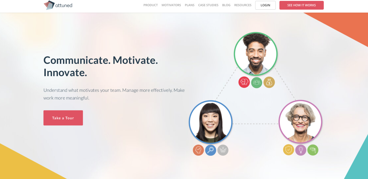
I joined Attuned in its early days. The product was still being developed and very early stage. A group of psychologists developed an innovative framework for addressing motivation at work, focusing on Intrinsic Motivation. I was responsible for developing all the product UI and UX, as well as consolidating the branding and standardizing all elements. I first managed a team of 3 developers, 1 QA in Vietnam; then later we hired people locally in Tokyo.
Timeline
One Year
Platform
Figma
Collaboration
2 Front-end Developer,
1 Back-end Developer,
1 QA
My Role
UX Designer
Product Manager
📄
Project overview
Attuned provides real-time reporting to track employee engagement levels, highlight blindspots, and offer suggested actions to avoid potential conflicts while ensuring greater overall alignment within teams.
✏️
Problem
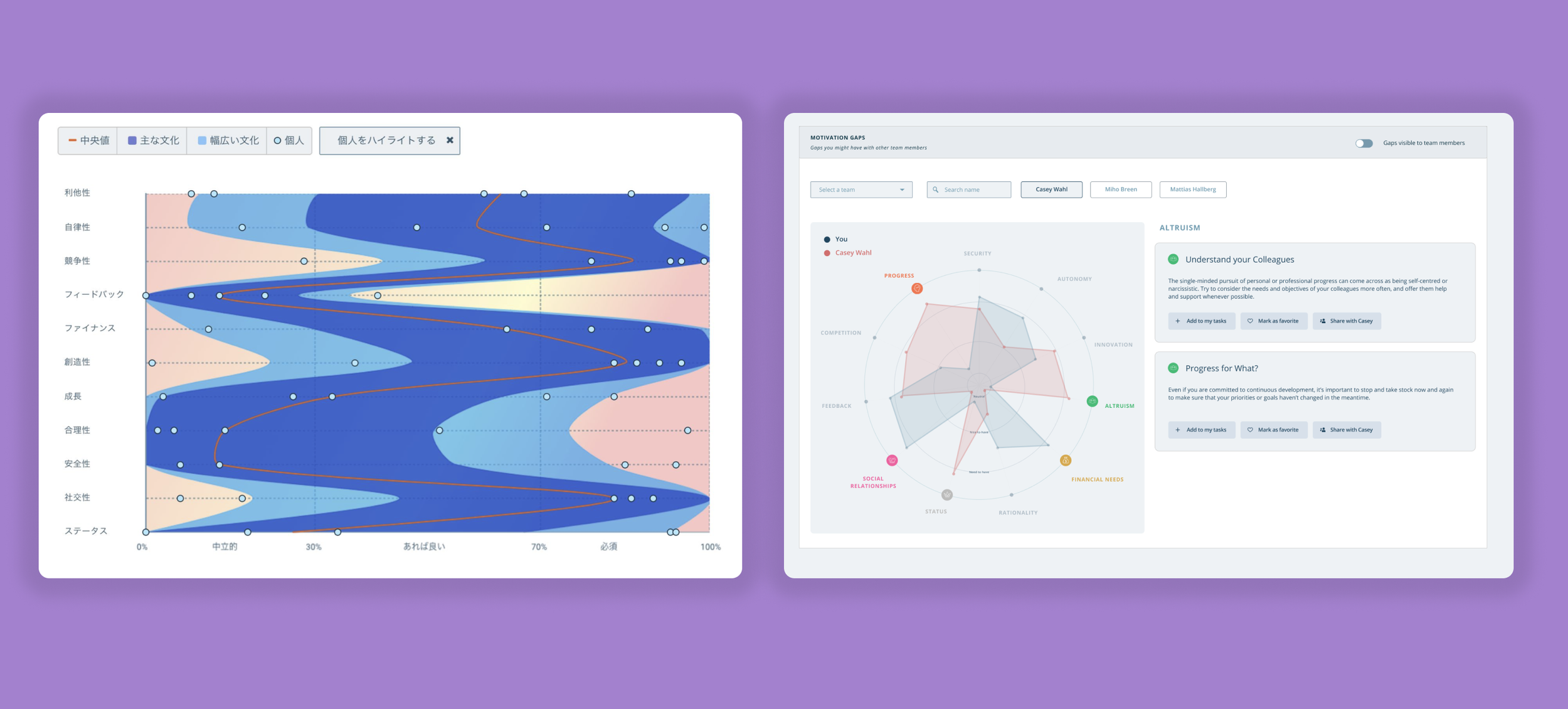
Attuned was a fairly new and innovative product at the time. It’s development were still in early stage when I joined, so I had to develop most of the branding and ways to display complex data charts. The main challenges on the design side were:
Its new approach to tackling motivation with 11 main motivators
1
The amount of data that needed to be displayed at all times
2
💡
Solution
I created the whole User Experience for the product and all UI elements. During the year that I worked on this project, I conducted several interviews and met with the clients regularly, always gathering their feedback and improving the product to meet their needs. I worked directly with developers, providing them an easy way to access the design files and helping with front-end coding whenever necessary.
👩🏻🦳
Persona
To understand the users, I worked closely with the founder and the team of psychologists. I also met with three early adopter clients weekly in order to understand their problems properly. I created personas for the main users of Attuned: managers, employees and candidates. Here is the manager persona:
🧭
Julie’s User Journey
✍🏼
Paper Wireframes
The process below begins with my initial ideas wireframes, then moves to mockups, and finally to the high-fidelity prototype. In this simple version, you can see how the product was being developed. The main areas that had to be tested were the Motivator Survey, Motivator Report, as well as the dashboard and main charts for data analysis.
🎨
Design System
🔁
Design Iterations
Motivator Report
The original report was delivered as a long PDF. I worked on several iterations until arriving on a dynamic report that allows the user to explore freely and understand their intrinsic motivators at their own pace.
💻
Mockups
💻
High-Fidelity Prototype
📱
Mobile Version
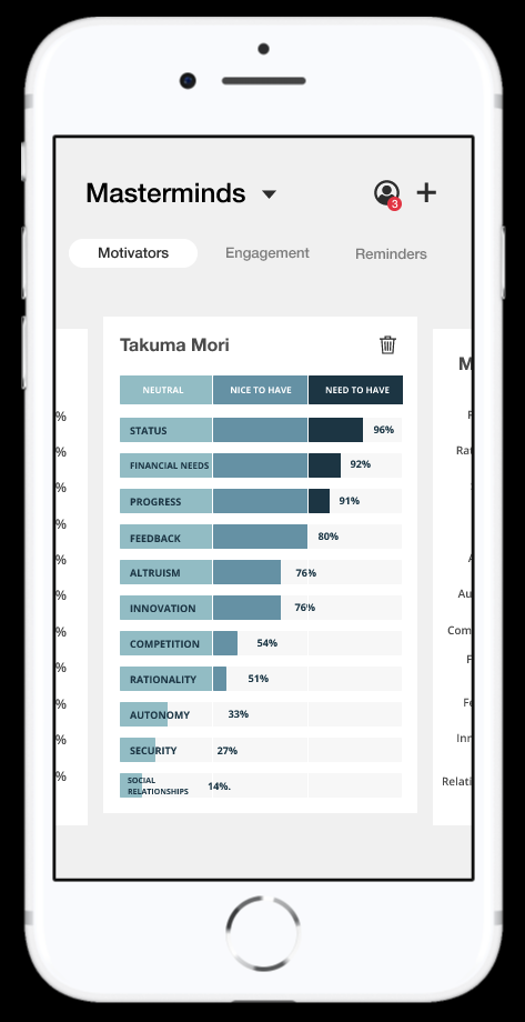
I made some specific designs when adapting to the mobile version because of the limited screen size.


🌱
Results and takeaways
Managed to release a full product in a few months, allowing the company to go from 0 to 35 clients in a year. The retention rate also increased 300% for managers checking their team’s reports.
👩🏽💻🧑🏻💻
Another key learning was the importance of a in-house development team. After the change from the vendor in Vietnam to a full-time team in Tokyo, the development was much smoother, with better clarity and communication and significant better performance and consistency.
Next project: Tapco (UI/UX Design)


